
 Resources
 Campus Life
 Just for you


 My Canyons
  Canvas

Guidelines
As articulated in the College of the Canyons Mission Statement, our commitment to inclusion supports an environment where all students can achieve their educational goals. We strive to fully include all who engage with us by ensuring that communications and content are accessible to everyone. As a public institution that receives federal, state, and local funding, we are legally required to comply with federal laws known as the Americans with Disabilities Act (ADA) and the U.S. Rehabilitation Act of 1973. Accessibility has many components and covers a range of topics that are too vast to include here. For the purposes of this guide, we will focus on some of the most common accessibility-related issues for digital communications.
We encourage you to be mindful of accessibility across the entire range of media as communication trends, technology, and delivery platforms evolve.

Why It's Important
An estimated 13 percent of Americans – about 42 million people – have a disability. Inaccessible content excludes people just as much as steps prevent someone with a physical disability from entering a building. Inaccessible content denies them equal access to information, which many courts have ruled a violation of the Americans with Disabilities Act (ADA). The ADA can be complicated, but it’s intent and spirit – to ensure that those with disabilities have the same opportunities as everyone else – aligns with the College of the Canyons mission of inclusivity.
Section 508 and ADA
Section 508 and ADA are terms that are often used interchangeably, but they are technically separate and unique. The ADA addresses accessibility in a broader sense, while Section 508 focuses on electronic content. Section 508 is a sub-section of the U.S. Rehabilitation Act of 1973 that requires electronic content to be accessible to people with disabilities. It also sets accessibility standards for websites and other digital communication tools and content, known as information communication technology. Section 508 was not part of the original Rehabilitation Act of 1973 but was added in 1998 to include accessibility requirements for all information technology.
Equal Access for Everyone
People with disabilities access digital content and navigate the web in a variety of ways:
- People who are blind or sight-impaired may use screen readers, which are devices that read aloud the text that appears on a screen, or screen magnifiers, both physical and software-based.
- People who are deaf or hard of hearing may rely on captions or transcripts. Videos should be captioned, and transcripts should accompany audio content. See Video & Audio
- People with mobility impairments may not be able to use a mouse, may rely on head pointers to interact with computers, or may require voice-recognition software to control their computers and devices with verbal commands.
- People with cognitive impairments experience a common set of functional issues that can be minimized by providing:
- Easily understood content using plain language.
- A clear focus on important content with minimal distractions.
- Logical, consistent design and layout of documents.
- Intuitive, consistent layout and navigation of websites and online content.
 Writing
The foundation of an accessible document is content that clearly and concisely conveys your message. This information applies not only to digital documents and content, but to all communications in its various forms.
General Guidelines
- Write clearly and use plain, straightforward language.
- Use short declarative sentences whenever possible.
- Keep content lean and relevant. More copy is not necessarily better, so eliminate unnecessary content that doesn’t get your message across.
- Use language your audience understands. Don’t get overly technical, avoid jargon, and provide definitions of institutional-specific terms that cannot be avoided.
- Acronyms and abbreviations may be ubiquitous at College of the Canyons, but they are not necessarily decipherable by external audiences. Avoid acronyms and abbreviations whenever possible. If you must use them, spell them out after first use.
Examples
- POOR – The orientation meeting will be held in BONH-106.
- GOOD – The orientation will be held in Bonelli Hall, Room 106.
Do not abbreviate names of college buildings – The naming convention for college buildings is the result of a technical limitation on the number of characters that can be used in our information systems. While acceptable in bulk listings such as the schedule of classes, use of these abbreviations in marketing material can be confusing to external audiences. Building names should be written out.
- POOR – The PAC celebrates its 20th anniversary this season.
- GOOD – The performing arts center celebrates its 20th anniversary this season.
 PDFs
PDFs
Most Microsoft 365/Office and related applications have accessibility features and settings that, when utilized, produce accessible PDFs that can be shared electronically.
General Guidelines
- Proper document structure utilizing headings, lists, and other element markups allows screen reader users to navigate content logically and efficiently.
- Become familiar with the application’s accessibility features.
- Images and other visual elements require alt text.
- Body text should be large enough (generally 12- to 14-point type) for people to read.
- Line spacing should be 1.5 or 2.0 whenever possible.
- Page margins should be no less than 0.5 on all sides (1.0 is preferable).
- Left-aligned text is easiest to read. Center-aligned text should be used sparingly.
- Do not write sentences in ALL CAPITAL LETTERS. They are harder to read. Limit the use of all-caps to sub headers and brief headings.
- Use styles such as italics, bold, and underline selectively, and avoid using them for entire paragraphs.
Helpful Tips
 Online Design
The proliferation of online graphic design platforms has simplified the design process, making it easy for anyone to create professional-looking marketing material with predesigned templates. But users should not assume that material generated by these services meets accessibility standards. Care should be taken to ensure that the template is accessible, and that subsequent edits and additions follow accessibility guidelines and practices.
Canva
Canva is a popular online design platform at College of the Canyons. It’s also notorious for producing inaccessible documents. But that’s not necessarily the platform’s fault. It is the user’s responsibility to ensure accessibility guidelines are followed. Like the design process itself, Canva has simplified the process for checking accessibility compliance with a tool called Design Accessibility. Learn more about Canva’s accessibility features.
Canva Design Accessibility
Follow these steps:
- Open the design you'd like to check for accessibility.
- From the Editor menu, select File, then click Settings.
- Select Check Design Accessibility from the options to open the Design Accessibility window.
You’ll see a summary of detected accessibility issues for typography, color contrast, and alt text, as well as steps to take to resolve these issues. Please note that this tool alone may not detect all accessibility issues, especially for PDFs, so the final document must be checked for accessibility compliance with a third-party application. See Accessibility Checkers
Color Contrast
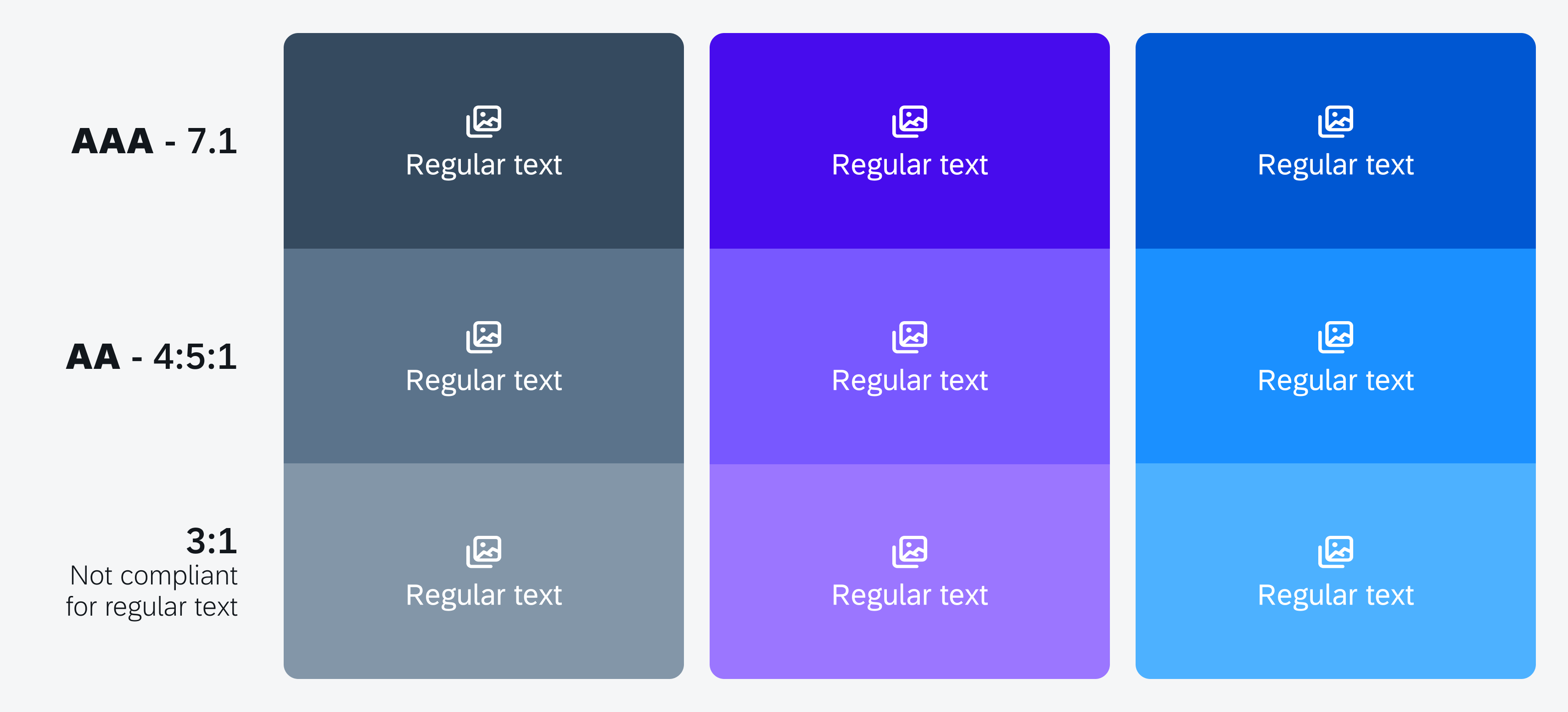
Color contrast is key to legibility and accessibility. Whether you’re creating a PDF, an event poster, or designing a webpage, it’s important to consider readability. Color combinations, reverse type, and type overlays can be challenging from an accessibility standpoint.
Contrast Ratio
Web Content Accessibility Guidelines (WCAG) require a contrast ratio of at least 4.5:1 for normal text and 3:1 for large text to achieve minimum compliance. Large text is defined as 14 point (typically 18.66px) and bold or larger, or 18 point (typically 24px) or larger.
Accessible Palettes
Color Safe provides accessible color palettes based on WCAG guidelines of text and background color ratios.
Checking Compliance
For websites and online media, use a web-based color contrast checker to check accessibility compliance. Color and link contrast checkers are available at no charge from WebAIM.
- Color Contrast Checker
- Link Contrast Checker
- Chrome Extension – The WCAG Color contrast checker is available as a free extension to the Chrome web browser. Visit the Chrome Web Store to install it.
TIP – Don’t use color as the only way to convey information. Use text or an icon as well.
Alt Text
All non-decorative images must be accompanied by a written description known as equivalent alternative text, more commonly referred to as alt text. Alt text is a description of an image that is read aloud to visually impaired users via a screen reader.
General Guidelines
- Limit alt text to no more than 125 characters, or 250 characters for grouped images such as collages.
- Avoid filler words such as “this is a photo of.”
- If the image consists primarily of embedded text, that text should be used verbatim as the alt text.
- If an image is used to provide direction or guide the user (such as an arrow), the alt text should guide the user in the same direction.
Write alt text as if you were describing the visual scene of the image to someone over the phone. Tell them what you see, concisely.
Example

POOR: A student with her degree.
GOOD: A female student in cap and gown smiles while holding up her degree during the commencement ceremony in the Honor Grove. Fellow graduates are seated behind her.
WCAG 2.1 Level AA
1. Core Rule: Accessible by Default
- Every post must be usable by people who cannot see, hear, or use a mouse/touch screen.
- If a platform feature can’t be made fully accessible (e.g., Stories, some TikToks), provide an accessible version on your website or in a feed post.
2. Images and Graphics
- Add alt text to every meaningful image using the platform’s built-in alt text field.
- If no alt text field exists, include a brief “Image description:” in the caption.
- Include who, what, when, where, and key details.
- Keep text large, readable, and high contrast.
- Avoid text-heavy fliers that are merely images; include full text in caption or link to an accessible web page.
3. Video, Reels, TikTok, Audio
- All videos must have accurate, synced captions.
- Include captions for spoken words and important sounds.
- If visuals provide meaning not stated in audio, add that info via narration, on-screen text, or caption.
- For Stories/TikToks with captioning limits, direct users to full information in bio or on the website.
- Audio: Text transcript is required for any live audio, Audio Notes, X Space, podcast style, etc.
4. Text, Emojis, Hashtags, GIFs
- Use clear, plain language.
- Use sentence case. Avoid ALL CAPS.
- Use bullets and short paragraphs.
- Use emojis sparingly and at the end of sentences.
- Use CamelCase for hashtags.
- Example: #StartHereGoFar
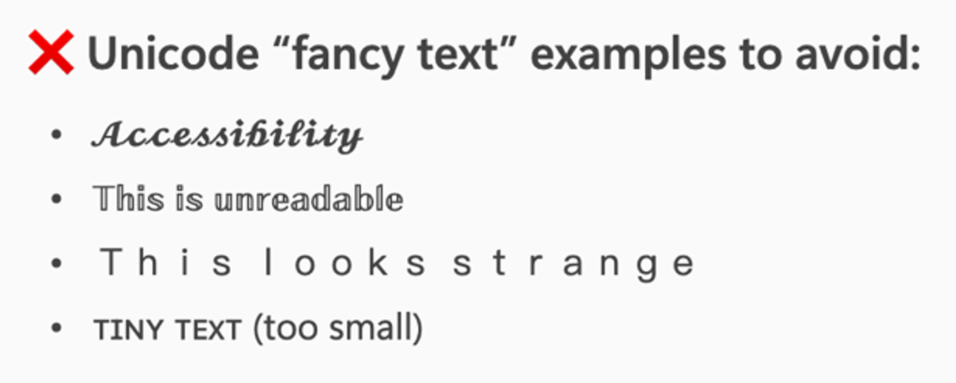
- Avoid decorative or Unicode fancy fonts for essential information.
- This refers to captions. Do not copy/paste fonts from font-generator websites. Use the platform's default.
- GIFs: Alt text support for GIFs is inconsistent across platforms. Avoid GIFs that flash more than three times per second; they can trigger photosensitive seizures.
- If you have to post a GIF (story or comment), treat it like alt text; it will need an image description.
- This refers to captions. Do not copy/paste fonts from font-generator websites. Use the platform's default.
5. Color, Contrast, Design Layout
- Normal text: 4.5:1 contrast ratio minimum
- Normal Text: Below 18 pt. font or 14 pt. if bold
- Large text: 3:1 contrast ratio minimum
- Large Text: 18 pt. or higher, 14 pt. bold
- Try the Contrast Checker
- Icons/UI elements: 3:1 minimum
- Do not rely on color alone to convey meaning.
- Avoid placing text over busy images without an overlay.
6. Links, Where Info Lives
Important Note: Text added via Instagram's native text tool may be readable by some screen readers, and link stickers may be navigable; however, Stories remain one of the least reliably accessible formats, so essential information should always appear in a feed post or linked page as well.
- Use descriptive link text (“Apply for Summer Classes”).
- This would be used to preface “click here for more info.” Or “link in the bio”
- I.e., “Register for the Fall 2026 Workshop: Link in bio.”
- If you must post full URL: “View the counseling appointment schedule: www.canyons.edu/student services”
- Link to fully accessible web pages for complex/event information
- In Stories/TikToks, clearly state where full info is available.
- If the story includes essential information, consider making it a feed post OR include a website link.
- If you add text directly to a story using Instagram’s text tool, screen readers can read it and navigate to link stickers.
- BUT no alt text for images in stories; can be too quick and are temporary.
- If you share a post to Stories, users with screen readers can navigate to post. If necessary include: “Tap this post to read full details”
- Maintain an accessible Linktree with descriptive labels. For Instagram, always describe what the link is before using "link in bio."
- Example: “Register for the Fall 2026 Workshop – link in bio.”
7. Platform-Specific Notes
- Instagram & Facebook: Use alt text fields; caption all videos and Reels.
- X/Twitter: Always add alt text; use concise text and CamelCase hashtags.
- LinkedIn: Include alt text, structured text, and captioned videos.
- TikTok: Enable captions, speak key information aloud, and add essential details in the video description.
8. Fonts: What You Can & Cannot Use
- Recommended: Arial, Helvetica, Verdana, Tohoma, Calibri, Roboto, Open Sans, Lato, Montserrat, Source Sans Pro, Georgia
- Allowed for decorative use: Pacifico (bold script), Playlist Script (thick brush script), Lobster Two, Amatic Bold (large only), Sacramento (large only).
- Use these only for event titles, theme words, and header text that is repeated elsewhere in readable text.
- Similar fonts are OK, but this list is safest. Always choose decorative fonts with thick strokes, clear letter shapes, and high readability.
- Do not use decorative or hard-to-read fonts for essential information such as dates, deadlines, instructions, URLs, or addresses.
- Wiggle room: within decorative graphics and non-essential info
9. Workflow and Posting Checklist
- Alt text added with essential info (who, what, when, where and why)
- Captions added and corrected with all info (repeat important info that is in graphic, if necessary)
- If using a scheduler, make sure alt text and captions are preserved.
- Text is readable with high contrast.
- Large text: 18 pt. or higher, or 14 pt. bold and up – 3:1
- Normal text: Below 18 pt. or 14 pt. bold – 4.5:1
- Easy-to-read font for essential info
- All essential information is provided in accessible text (not just inside images or videos) Is it in your caption? Does it need to be included in your Linktree?
- Descriptive links included: Make sure the link is described as what it is AND where it is.
- If video or audio: Does it have/need closed captions?
Alt Text for Social Media
You can add alt text to images in social media posts using each platform’s edit or advanced settings feature.
X (Twitter)
Follow these steps to enter alt text for images:
- Click the Post compose
- Attach your photo(s).
- Click Add description.
- Type your description of the image and click Done.
- Descriptions can be added for each image in a post.
Follow these steps to edit alt text for images:
- Click Photo/Video at the top of your Feed.
- Select the photo you want to add.
- Hover over the photo and click Edit.
- Click Alternative text in the menu on the left side.
- The automatically generated text will be shown on the left side of your photo. Click Override generated alt text to edit it.
- Write your alt text in the box. To change back to the automatically generated text, click Clear.
- Click Save at bottom left.
Follow these steps to edit alt text for images before you post:
- Upload an existing photo.
- Choose a filter and edit the image, then click Next.
- Click Accessibility, then write alt text in the box.
- Click Share to post.
Follow these steps to change the alt text of a photo after you post:
- Above your photo or video, click •••.
- Click Edit.
- Click Accessibility, then write the alt text in the box.
- Click Done to save changes.
Follow these steps to add or edit alt text for images:
- Uploading your image.
- Click text below image.
- Enter your alt text.
- Click Save.
Video & Audio
Just as alt text provides context for images, video captioning and audio transcripts help make media accessible to people with visual or auditory impairments.
Captioning
Videos must be captioned to be accessible. There are two types of captions: open and closed. Open captions are always in view and cannot be turned off, whereas closed captions can be turned on and off by the viewer. You can caption a video yourself with a free caption-editing tool, use a paid service provider, or utilize platform-specific captioning tools.
YouTube, Facebook and Vimeo
YouTube, Facebook and Vimeo support closed captioning, so open captioning is not necessary. It’s important to proofread and correct the closed caption file before publishing and promoting your video, as auto-generated caption files often contain misspellings and errors.
Twitter, Instagram and LinkedIn
Twitter, Instagram and LinkedIn do not support closed captioning. Open captioning is required for accessibility compliance. Please refer to the specific platform for instructions on creating and loading open captions.
Transcripts
Transcripts convert audio into readable text. However, transcripts exist in a separate scrollable document instead of time-coded text in a video.
Tips
- Convert your audio to captions using a caption-editing tool or service.
- Most caption-editing tools include the ability to export a transcript.
- Transcripts should include all audio, on-screen text, and any necessary visual information.
Websites
The content management system for the College of the Canyons website will dictate most of the layout and design elements for any given page, but there are still issues you should be aware of when creating, updating, or editing a page.
- Do not write sentences in ALL CAPITAL LETTERS. They are more difficult to read. All-caps are acceptable in limited circumstances, such as short page or section headers, but it’s generally best to avoid them whenever possible.
- Do not underline words unless they are hyperlinks.
- Avoid applying a bold style to words for emphasis. These can also be mistaken for hyperlinks.
- Follow a logical content hierarchy: Page Title, Heading 1, Heading 2, Heading 3, Paragraph/Body Text, etc. Headings should be used in numerical order starting at the top of the page (e.g. Heading 1 cannot follow Heading 2 or 3).
NOTE – The actual naming of these elements may be different after an anticipated transition to a new content management system.
- Provide page titles, descriptions, and keywords in page settings.
- Provide appropriate alt text and titles for images.
- Provide appropriate descriptions for hyperlinks.